Diva Challenge 122: Grid (un)Locked

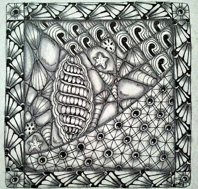
This week's challenge was a fun one. It was to use grids, which I do a lot anyway so this week's entry was pretty angst free:


I did this week's challenge in my new art journal that is made with tan-toned paper. I think I really like it. It gives things a softer look. I might try and snag a brown pen and see what that looks like next.

No grids in this one! This is unshaded but it was the first piece I did in the new journal. For once I pulled off an 'airy' piece that isn't packed with tangles in every square inch!
Comments

love the grid tile-looks like the seashore-shells and nets.
your airy one is lovely.
i have a brown paper pad,too. I have found a white pencil makes very nice highlighting on it. I think you will like the brown or burnt sienna pen with it, too
Your shading on the first one is awesosme. I really am enjoying all the entries for this particular challenge. Yours is gorgeous. And I really like your piece about the rain.
Bessamy said…
Oh wow!!!! Your tile pops to life! Those seashells look real! What a beautiful piece of art!
Michelle said…
I like both of them, but agree with the comment that the shading on the first one is awesome!
Uuna said…
I like Your zentangle very much. They are so artistic and beautiful. The second one is flying. That's very fine to see.
Unknown said…
I especially like your frame in the first tile, and love the lightness of the second. Very nice work!
Tangle Bright said…
Your first tile is lovely and has incredible shading! I love your second tile with it's airy feel. It is so hard to not fill in every single inch of space especially when you're in the 'Zen Zone' and nothing else matters. :)

Be creative and catch some Happy!

Jacque Solomon
www.tanglebright.com
I can't chose my favorite, both ZIA's have their own charme! You've done a great job with the Challenge one, but the airy feel of the second is very attractive too!!
Chrissie said…
Beautiful, my eye is drawn to the short black walking sticks for some reason. Great contrast.
Like all the aquatic flair of the tangles. The shading is great also. I like the airiness of your second ZIA.
ledenzer said…
So rich and majestic!
Anonymous said…
I love your tile! The patterns look great and I'm absolutely amazed by your shading. The border looks fabulous!

And your airy piece looks very cool, too. Very flowing and light.
Both are so different and yet so beautiful!
Shelly Beauch said…
Sensational shading in your challenge tile and sweet seeds floating with delight on your journal page.
Unknown said…
I love your new journal tangle, nice job
Unknown said…
I really like your first tile. The sea theme is brilliant- but I have to say that the second is my fav. I like the airiness of it.
I love all the little seashells!
Great frame.
Anonymous said…
So pretty! I have just done a beach-themed Zentangle drawing myself, but have not uploaded it yet. I will get to it tonight!

Popular posts from this blog

Thank Goodness for Blog Buddies

Lots of New Tangle Pattern Ideas!

Wicked Wonderful Weekend