Today's Creation
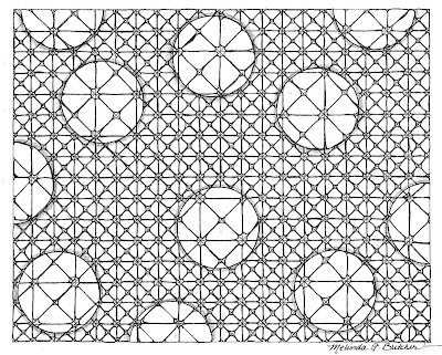
Actually last night's. I got orders for custom bags at the show but couldn't get started on them because I didn't have the bags themselves so I indulged in some good old fashioned doodling on paper for the first time in two months. Here's a scan of the piece I did. I like the concept of this, but there is something intrinsically wrong with it that I can't put finger on. The spacing of the magnifiers maybe? It's an 8x10 idea of something I'd like to do a lot larger but not if I can't figure out what's up with it.
Anyway, for better or worse....
Any suggestions greatly appreciated!
Anyway, for better or worse....
Any suggestions greatly appreciated!


Comments
With that said, it isn't all the magnified areas but the ones where there are lines very near to the edge.
No idea how to "fix" it or change it. I'm not that smart...
I think I figured it out. You've made an optical disillusion. In the 2 circles more or less in the center, one above the other, the eye expects the vertical line that crosses both will be seen in both, but it isn't. The circles around the edges seem to conform to this expectation. You can follow one line all the way across, even as it crosses the circles. Maybe if all the circles were "off" or all conforming, the sense of tension would go away. I kind of like that it's Not Quite Right.
And, on a totally random note, I've decided you needed the Versatile Blogger award :) If you look at my blog, you can find out more about it.